Case Study · Production Alert Dashboard
AndonX
A real-time production alert dashboard for Strand Products’ shop and cleanroom floors — built to make one thing legible from across a room: a stalled workcenter that needs a response, now.
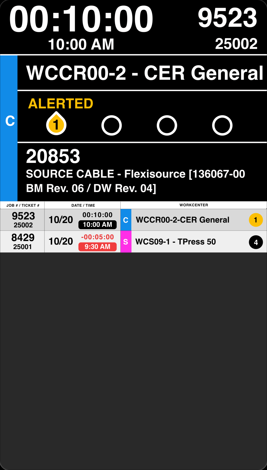
It sits on top of the same PLEX ERP data operators already used, and turns a flat, undifferentiated status picker into something readable on a 60-inch TV from across a shop floor — every active job tracked against a 10-minute initial-response goal, in three physical locations. This is my flagship case study: the one project among the set built with a real cross-functional team, a real client budget, and a real deadline — and it’s live in production today.
How this was built
A real team. A real budget. No AI in the build.
On my personal projects I direct an AI development partner through implementation. AndonX was different. It was a client engagement for Strand Products, designed and shipped by a small cross-functional team — a web developer, a principal stakeholder, and a full group of real users who weighed in before launch. That distinction is the point of including it: this is the project that shows I can collaborate on a shared, resourced, accountable build — not just direct a partner solo.
Team & Role
Designed alongside a real cross-functional team
I owned the UX — the research, the interaction model, and the visual system that made an urgent state legible from across a room. I worked day to day with the developer and the principal stakeholder, and the rest of the team shaped the tool through review before it went live.
The Product
In the order a supervisor would actually encounter it
AndonX doesn’t replace PLEX — it reads the same data and re-presents it for a glance-and-act decision. The screenshots below carry AndonX’s real, much bolder near-black / magenta / blue / amber brand. That jump in contrast from this page’s own quiet chrome is intentional: it’s the difference the design had to create.
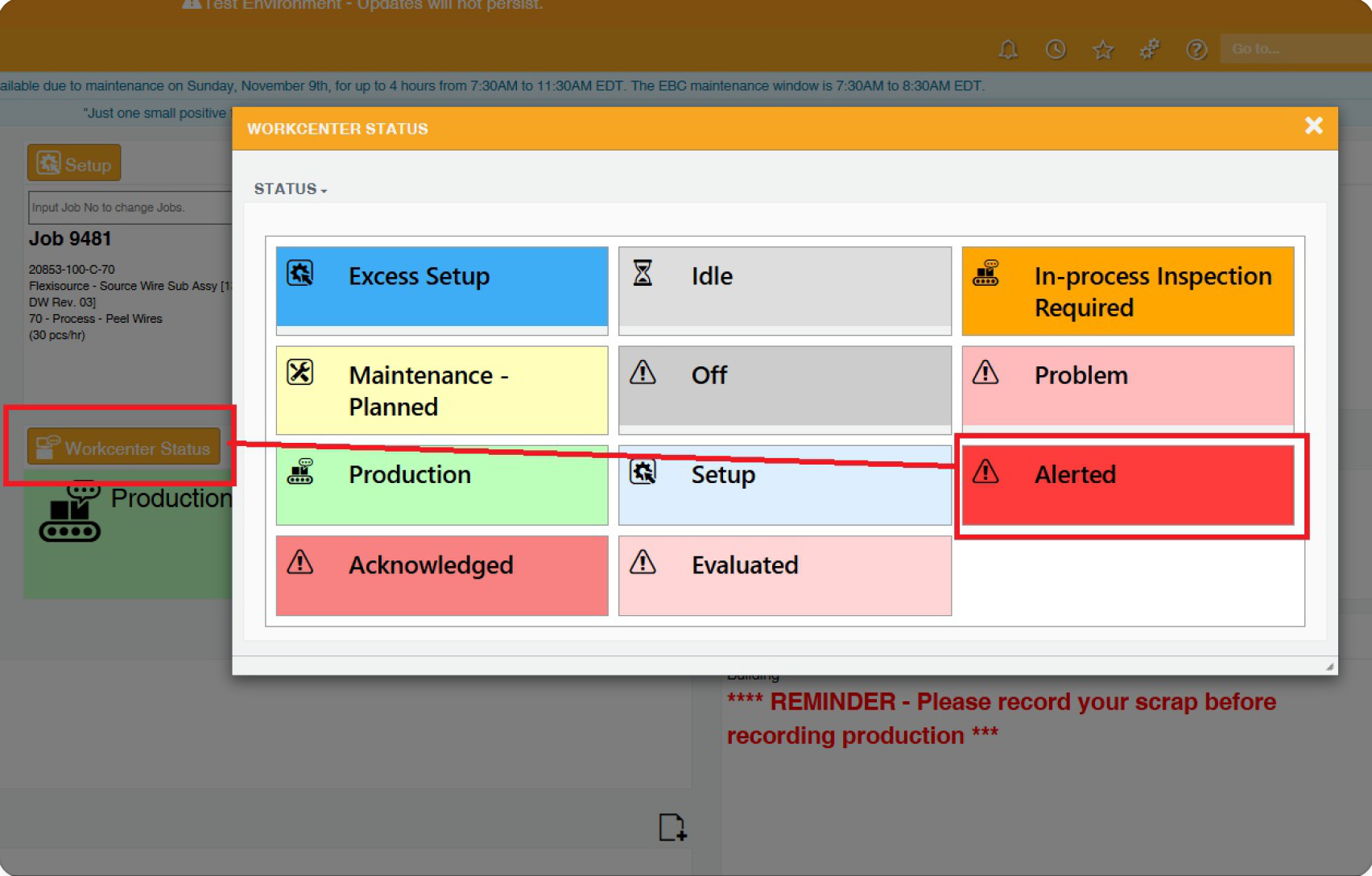
Before · PLEX native
PLEX’s native ‘Workcenter Status’ picker: nine flat tiles, equal visual weight. ‘Idle’ and ‘Alerted’ read the same. Useless for a three-second decision across a room.
The core problem
Nine tiles, all shouting at the same volume
Operators had no fast way to flag a stalled workcenter to a supervisor. PLEX’s picker treated every status — ‘Idle’, ‘Production’, ‘Alerted’ — with identical weight. The design job wasn’t to redesign PLEX. It was to take that same data and make the most urgent state instantly obvious from a TV mounted across a floor.
After · The AndonX TV dashboard
The full ticket lifecycle, on the stage-black screen a supervisor reads across the room — from the alert firing to the response closing out.
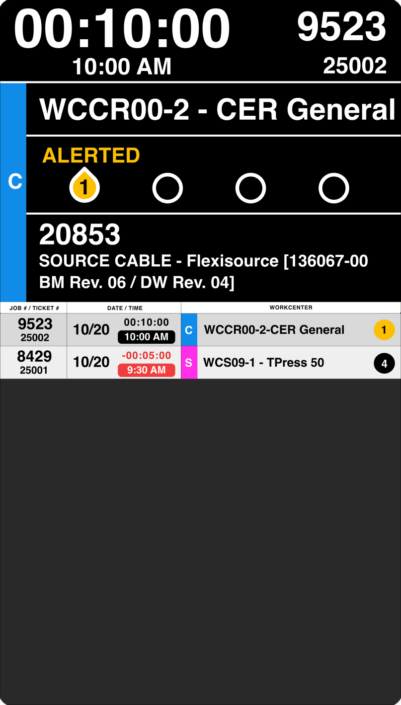
1 · Alerted
An alert fires. The 10-minute goal starts counting down in white, and step one of four goes active on the tracker.
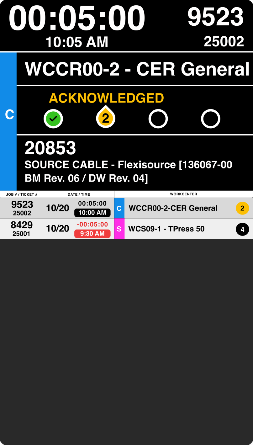
2 · Acknowledged
Someone responds inside the goal. Step one gets a green check; step two becomes the active yellow droplet. The timer is still white — still safe.
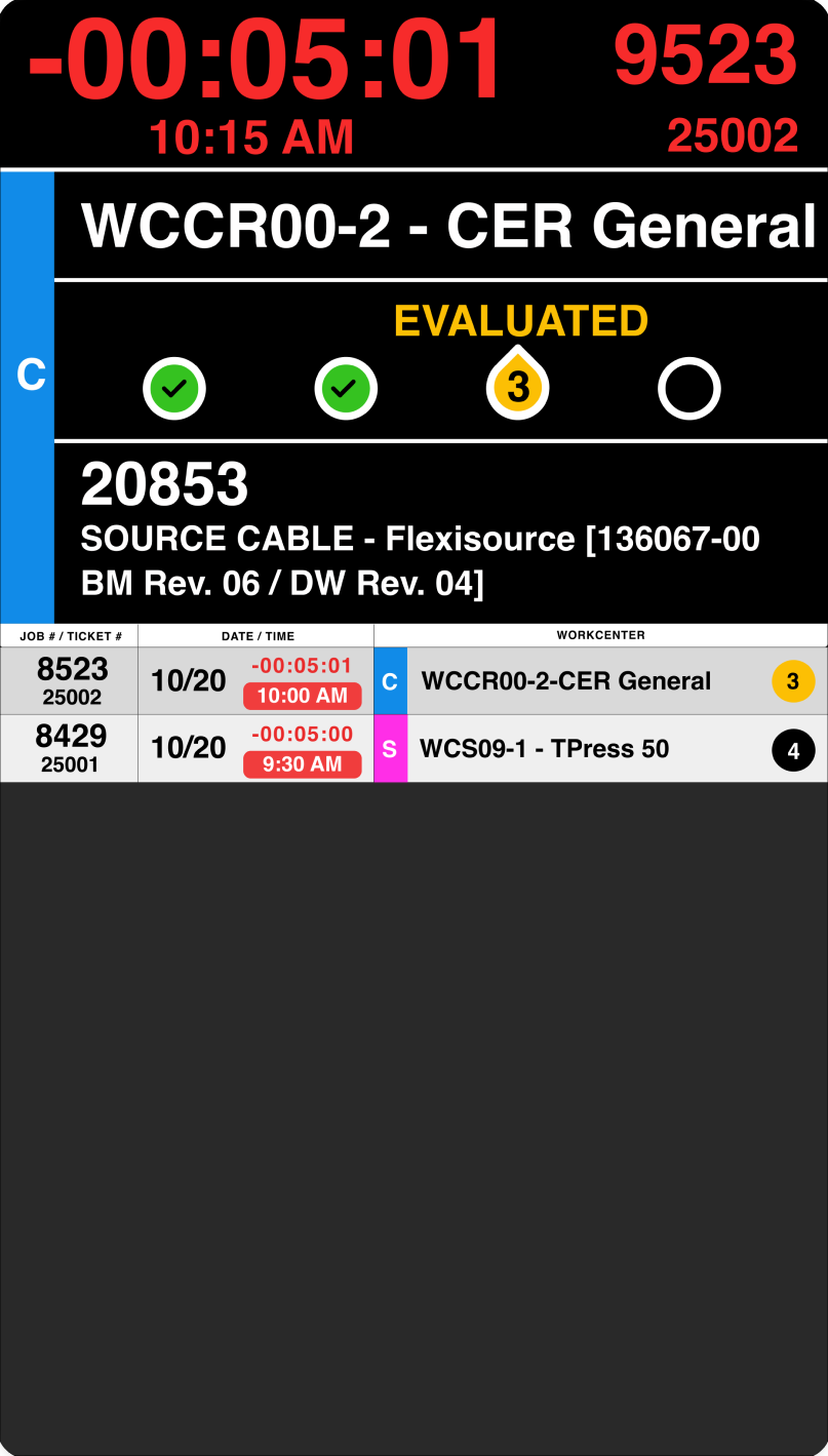
3 · Evaluated
The issue is being assessed — and the clock has passed ten minutes, so the timer has turned red. The escalation is visible from across the room, no second glance.
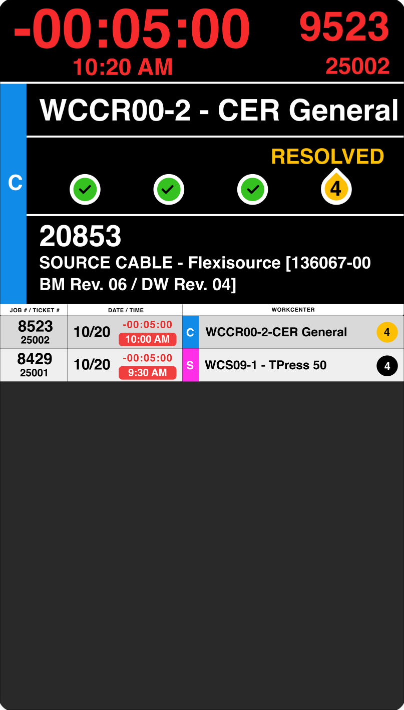
4 · Resolved
The response closes out. Three green checks, RESOLVED. Under the hood there’s no distinct ‘Resolved’ status — the ticket simply returns to Production.

Design system · Annotated
The real annotated decision sheet: white timer turning red at 10 minutes, green check for a completed step, yellow droplet for the current one, and the timer pausing once a ticket is resolved.
Process · Decisions
Seven decisions, and why I made them
Not a generic process diagram — the real before/after moments that shaped the tool, including the honest engineering caveats I didn’t hide.
Own one thing: initial response time
Job tracking, history, reporting — all real, valid ideas the team wanted. Each one would have added a screen, a state, a reason to look twice.
We drew a hard boundary on day one. AndonX owns initial response time and nothing else. The other ideas were named and deliberately deferred, not dismissed — so they couldn’t dilute the one job the tool had to do well.
“A tool that tries to do everything is a tool nobody can read from across a room in three seconds.”
Turning a flat picker into an urgent, ranked system
PLEX’s status modal gave ‘Idle’ and ‘Alerted’ the same visual weight — fine for a click, useless for a glance.
AndonX ranks by urgency in the design itself: the most urgent state is the biggest, boldest, most saturated thing on the screen, sized and colored to read from across a shop floor without anyone walking closer.
The 10-minute goal is built into the color itself
A separate alarm or badge would mean a second glance — and a second thing to notice, miss, or ignore.
The timer stays white, then turns red at exactly the 10-minute response threshold. No separate alert. The color is the escalation — the single most-legible signal on the board.
“No second glance required. The color is the escalation mechanism.”
A 4-step tracker for the whole ticket, not just its current state
Showing only the current status tells you where a ticket is — but not how far it’s come or what’s left.
A row of four circles walks the full lifecycle — Alerted, Acknowledged, Evaluated, Resolved — with a green check for a completed step and a yellow droplet for the one in progress, readable at a glance. Honest data-model note: there’s no distinct ‘Resolved’ status underneath; a resolved ticket returns to Production. A real engineering constraint, surfaced rather than hidden.
A real launch, not a quiet deploy
A dashboard that appears on a wall one morning with no context is a dashboard people learn to ignore.
A dedicated Beta Launch workshop in November 2025, a full SOP with real state-by-state screenshots, and three standing support Slack channels — #andonx-errors, #andonx-general, #andonx-reporting — opened before launch and still active today.
The org restructured around what the tool surfaced
The prior system had no alert states at all — so there’s no clean baseline to measure a before/after against.
56% of tracked alerts were acknowledged within the 10-minute goal, at a 7-minute median. The client’s own read was that the department shifted from a highly critical need to one running smoothly (his characterization, not a data-proven delta). And ownership of the response moved from QA to engineering, who relocated a dedicated person into the cleanroom.
“The org restructuring around what the tool surfaced is its own kind of validation.”
The baseline I never captured, and the team I met too late
The developer and I worked closely with the CEO for most of the project, largely apart from the broader team. And I never paused to document baseline response times before building.
So the tool’s real impact rests on the client’s word rather than data I can point to independently. And once the wider team engaged post-launch, better operational solutions surfaced fast — a good outcome that would have made a stronger tool if that group had been in the room from day one.
Impact
The exact metric it was built to move
The client’s own read was that the department went from a highly critical need to one running smoothly. I’m stating that as his characterization, not a data-proven before/after — the alert states didn’t exist under the prior system, so there is no baseline to prove it against.
The tool surfaced the response gap clearly enough that the org restructured around it: ownership moved from the original target users in QA to engineering, who relocated a dedicated person into the cleanroom to hold it.
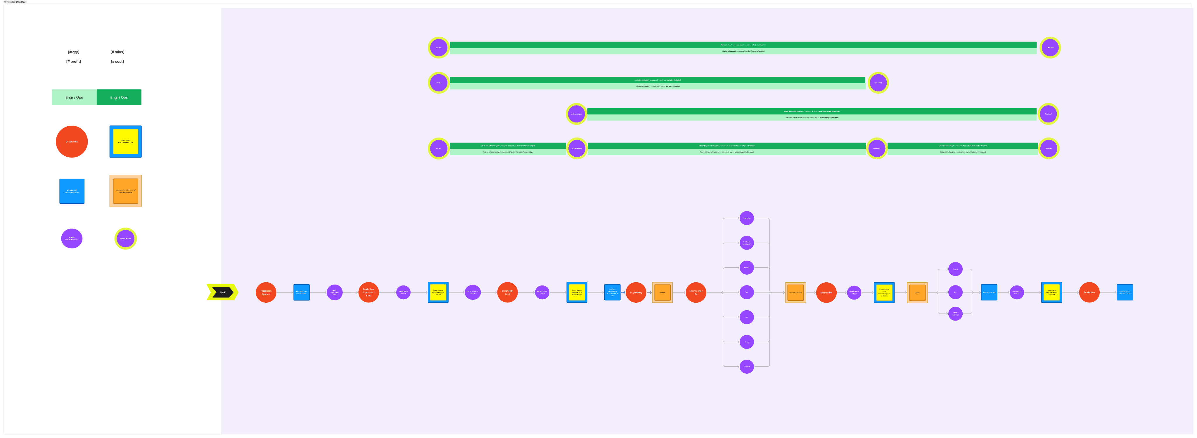
The research that led to AndonX · Production & QA response workflow
What’s next & what I’d do differently
Honest about where it stands
AndonX launched through a real workshop in November 2025 and is live and adopted today — but it never advanced past that initial beta. Funding was pulled shortly after launch, and the company has no current plans to invest further, despite the tool being underused relative to what it could still show a team like this. I’d rather say that plainly than imply an ongoing, fully-realized product.
Capture the baseline before you build
I never documented baseline response times or collected explicit before/after statements from the team up front — so the real impact today rests on the client’s word rather than data I could point to independently.
Get the whole team in the room sooner
We worked mostly with the CEO, apart from the broader team. Once the rest of the group got involved post-launch, better operational solutions surfaced fast — which would have shaped a stronger tool from day one.
What this demonstrates
Capabilities I bring to any team
AndonX is one project, but the practice behind it travels — it’s how I approach collaboration, constraint, and craft on anything with real stakes and real people around the table.
Real cross-functional collaboration
Designing alongside a developer and a principal stakeholder, with a full team of real users whose feedback shaped the outcome.
Designing for a shared, glance-based environment
A TV read from across a room, not a screen in someone’s hand — legibility, scale, and hierarchy as the whole job.
Translating a legacy enterprise system
Turning PLEX’s raw status data into something actionable without redesigning the system underneath it.
Deliberate scope discipline
Protecting a tool’s core job from feature creep, even when more was clearly possible.
Honest handling of constraints & data
Measuring real impact carefully, naming what wasn’t proven, and being direct about what a funding cut actually stopped.
Influencing organizational behavior
The tool surfaced a problem clearly enough that the client’s team restructured around it.
Let’s talk