Case Study · Invoicing Tool
MoneyMaker App
An internal tool — a guided wizard that turns my own tracked hours into a QuickBooks invoice — designed so every number is obviously safe to send, or obviously not.
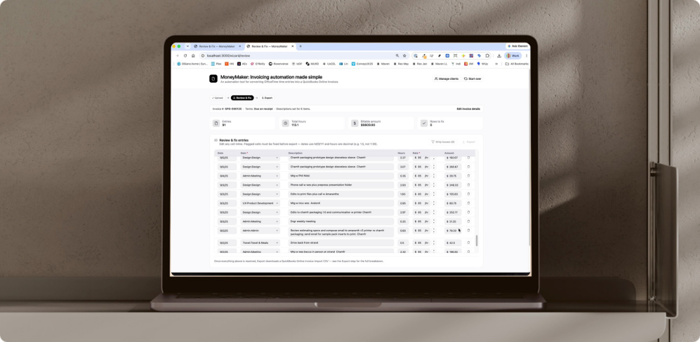
It replaced a fragile manual process — reshaping the same data by hand across five file formats, 1–2 hours a cycle, partly run through a tool built by a developer I can no longer reach (a real business-continuity risk). The friction was bad enough that invoicing sometimes slipped, and that hit my own cash flow directly.
How this was built
I directed an AI development partner through implementation the way a senior designer directs an engineer.
Real product judgment, a running decision log, and accountability for the result — not just prompting for code. The decisions below are the evidence: each one is a call I made and can defend, from business logic to a financial-data trust bug to measured accessibility.
The Product
In the order a user actually moves
Upload, set up the client only when a project needs it, review and fix, then export. The core design problem was trust — this touches real client billing data, so every screen has to answer one question: is this safe to send yet?
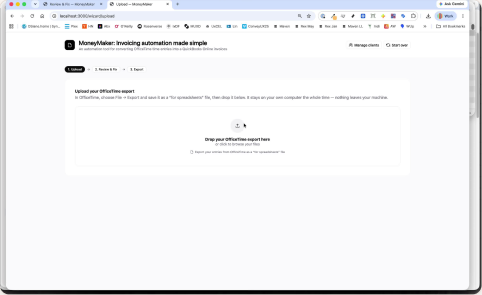
Step 1 · Upload. Drop the OfficeTime export — it stays on your machine, and the stray tracking column is detected and dropped automatically.
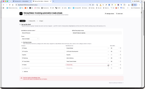
Only when needed · Set up client. A gate that appears solely to fill the one gap — here, a single service still needs a QuickBooks item.
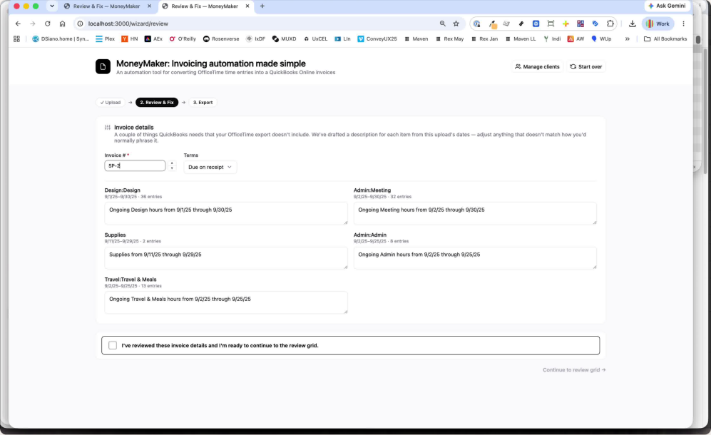
Invoice details. The few things QuickBooks needs that OfficeTime doesn’t include — invoice number, terms, and a drafted description per category, ready to adjust.
Review & Fix — the centerpiece
The dense grid, doing the real work. When everything checks out, “Rows to fix” reads 0 and the invoice is calm.
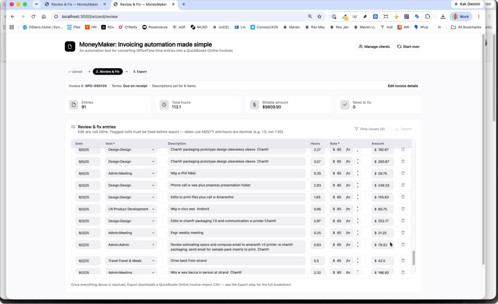
Review & Fix (clean). 91 entries, $9,809.90, zero rows to fix — the calm state a user should recognize instantly.
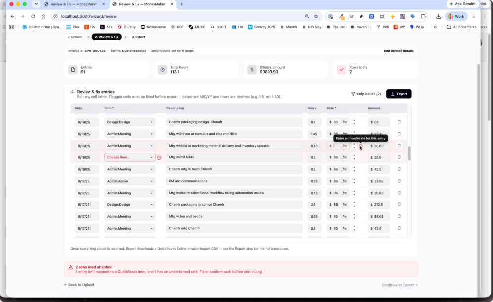
Review & Fix (flagged). Live validation at real volume: a “2 rows to fix” count, an “Only issues” filter, per-row highlighting, and inline guidance — never one blocking banner.

Step 3 · Export. A clean hand-off — downloaded once, with a manual “download again” and step-by-step QuickBooks import guidance.
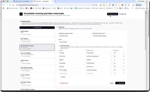
Manage clients. The mapping that makes future uploads “just work” — projects to customers, categories to items, per-service rates.
Decision log
Six calls, and why I made them
Not a generic process diagram — the actual before/after moments, kept the way I kept them while building.
Invoice numbering that doesn’t interrupt the cycle
A single shared invoice sequence is simplest, but gives away privacy and leverage unnecessarily. The obvious fix, a sequence per client, couldn’t be trusted by hand: tracked manually, it risked duplicates and mix-ups with no way to catch them.
I designed a system that auto-suggests each client’s next number (e.g. SP-2604) the moment their last invoice was actually sent, with a manual override always in reach. The common path is invisible; the exception is one field away.
A messy invoice should never feel like a dead end
A real invoice can carry dozens of problem rows at once. A single blocking error banner turns that into a wall — fix one thing, re-run, hit the wall again.
One honest “Rows to fix” count, an “Only issues” filter, and per-row inline flags. You triage 91 line items the way you’d triage a real to-do list.
The warning that cleared itself on the wrong row
Editing one row’s rate silently cleared a different row’s “still needs confirming” warning. The validation checked whether any rate field had been touched — not each field’s own state.
Root-caused it to shared state and rebuilt it as real per-field tracking. Each row now owns its own status, independently.
“A warning that clears itself on the wrong row isn’t a UI bug on a financial document — it’s a trust bug.”
Deleting the landmine, not labeling it
The raw OfficeTime export ships an extra column that had to be deleted before every upload. Forget it and nothing errored — every field just shifted over by one, silently.
I had the parser auto-detect and drop the column instead of adding a reminder. The mistake stopped being possible.
“A required manual step you can forget isn’t a workflow, it’s a landmine. The right fix wasn’t a warning before the landmine — it was removing the landmine.”
Contrast measured, not eyeballed
The colored status tints looked fine on screen. Measured, the translucent fills came in at 3.45:1 — below the 4.5:1 AA floor for the exact numbers a user relies on to trust the row.
Switched to solid status backgrounds and re-measured computationally until every state cleared AA. Legibility you can prove, not assume.
Small fixes that protect the whole
The export screen re-downloaded the file on every back-navigation. Reordering clients reset your scroll position. Individually minor — together, the feel of a tool you can’t quite trust.
Download once per invoice with a manual “download again” always available; scroll position preserved on reorder. The details that make a tool feel steady.
I built a real OAuth flow — then chose to retire it
Earlier in the project I designed a genuine connect-to-QuickBooks OAuth experience. Once the CSV path covered the real need, I made the deliberate call to retire the OAuth flow for something simpler and lower-risk. Worth including as a decision, not hidden as a dead end — knowing when to remove your own work is part of the judgment.
Outcome
Why it was worth it
Choosing the more rigorous path — real per-field state tracking, a parser that removes a failure mode instead of warning about it, measured contrast instead of eyeballed contrast — paid off. When the goal is a financial document you can actually trust, the extra effort is worth it every time. But it’s worth being honest about the trade-offs too:
What worked
- ✓ Every line is flagged individually — never an all-or-nothing failure on export.
- ✓ A forgotten manual spreadsheet step can no longer silently corrupt an invoice.
- ✓ Every colored status indicator is now measured against WCAG AA, not just eyeballed.
Trade-offs
- ✕ Single-user tool, never instrumented with analytics — no true before/after number to point to, only the honest estimate above.
- ✕ The itemized breakdown is still a manual Print / Save as PDF step, not a generated PDF.
- ✕ A real QuickBooks OAuth integration was built and worked — then deliberately retired once CSV import covered the need at lower ongoing risk; it isn’t live today by choice, not by failure.
Final thoughts
Working on MoneyMaker was equal parts product judgment and craft: deciding what a four-step wizard should actually gate versus let through, and then making sure every one of those gates was legible, accessible, and correct under real volume — not just in a short test file.
The throughline across almost every real bug this project surfaced is the same one: a manual, forgettable step, or a piece of state that meant two different things in two different places, both fixed the same way — not with better error copy, but by removing the condition that made the error possible at all. That’s the standard I’d bring to a shared, multi-tenant product, not just a personal tool.
What this demonstrates
Capabilities I bring to any product
MoneyMaker is one system, but the practice behind it travels — it’s how I approach research, trust, and craft on anything with real stakes.
Trust & legibility in financial data
Designing so a person can tell, at a glance, whether a number is safe to send or still needs a human’s confirmation.
Root-causing state bugs, not just filing them
Tracing a self-clearing warning to shared state and directing the fix to real per-field tracking — product judgment, not a ticket.
Accessibility as a verified practice
Computing contrast ratios against the AA floor and re-measuring after the fix, rather than trusting how it looks on screen.
Authentication flow, then a real trade-off
Designed a full OAuth connect-to-QuickBooks flow, then made the deliberate call to retire it for a simpler, lower-risk CSV path once that covered the need.
Dense, information-heavy interfaces
The Review & Fix grid stays calm and scannable across 91 line items on a single real invoice.
A documented, decision-logged process
Every decision above came from a running log — the reasoning is the deliverable, not a retrofit.
Technologies
Frontend
Plain HTML / CSS / vanilla JS — deliberately no framework. Every screen designed in Figma first, built to match.
Backend
Node.js, Express. Cookie-keyed in-memory session state — no database, by design, for a single-user local tool.
Integration
QuickBooks Online invoice-import CSV format. OAuth 2.0 (built, verified, deliberately retired).
Let’s talk